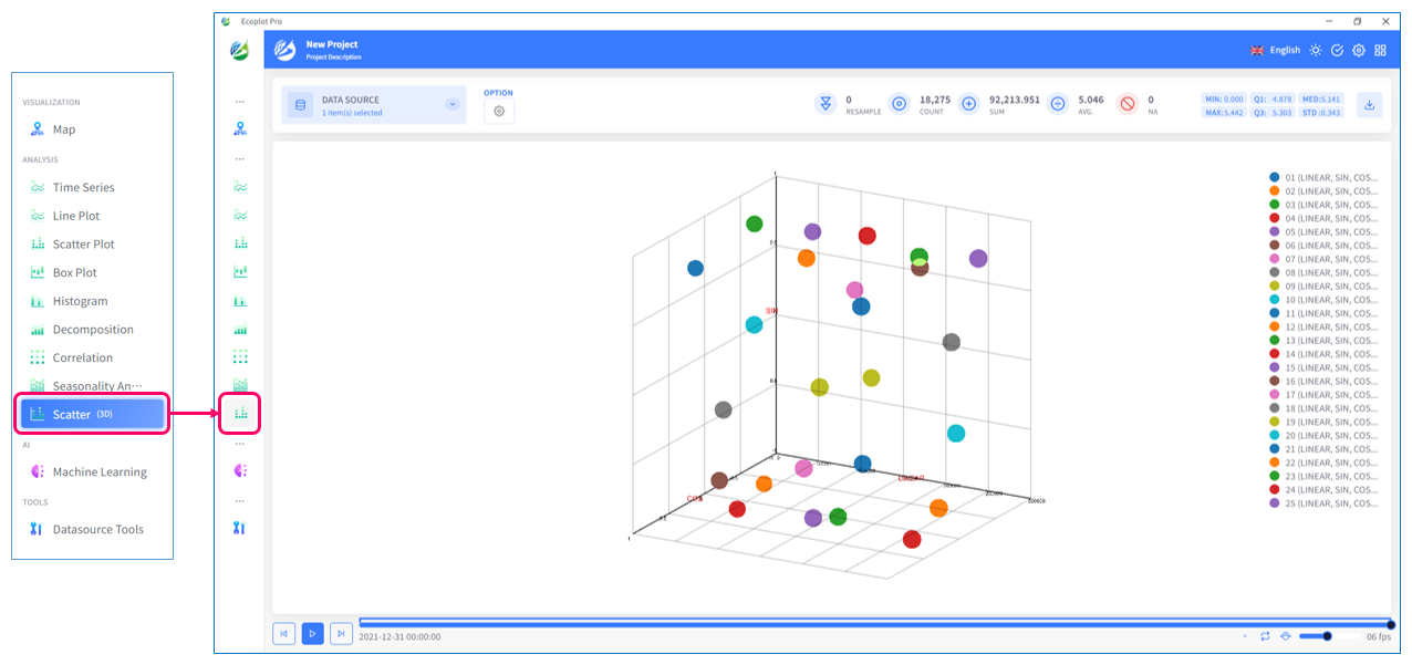
3D Scatter
Overview
The [3D Scatter Plot] tab is a powerful tool for visually exploring relationships between three-dimensional data. In this tab, you can assign three variables to the X, Y, and Z axes and plot each data point in a three-dimensional space. Additionally, it is possible to express a fourth variable as size.
This allows for an intuitive understanding of the structure and trends in complex multivariate data. Furthermore, 3D scatter plots can reveal information that is often overlooked in two-dimensional scatter plots, such as data density, distribution, and the presence of clusters (groups).
Thus, the [3D Scatter Plot] tab is an extremely useful tool for exploratory data analysis and is an essential feature for deepening the understanding of multivariate data. It can be utilized in various situations, such as decision-making in business and data interpretation in research.
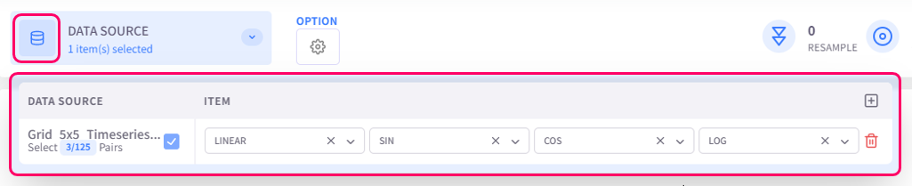
Select data to display
Click the Datasource button on the upper left corner of the screen and select data to be plotted.
Change display style
Click the Option button on the upper left corner of the screen to open the display style settings menu.
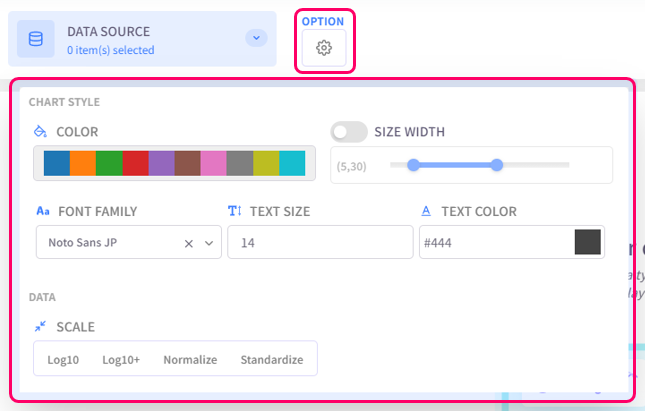
- Color: select the color palette for the chart
- Size Width: configure the dot size and line width of the chart
- Text settings (Font family, Text size, Text color): configure the style of text for chart titles, legend items, axis labels
- Scale: select the data scaling method
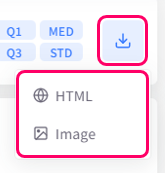
Save graph
You can choose to save the plotted graph as an HTML or image file.