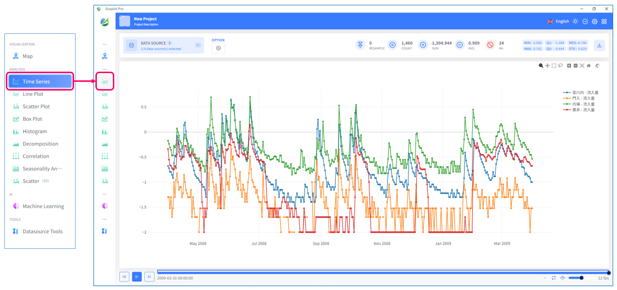
Time Series
Overview
In Analysis tools panel, select Time Series. In Time Series tab, all time-series data imported by user on the main map screen are graphed as a two-axis (XY) plot. User can change display range, zoom in and out, and interactively check the displayed numerical value, etc. simply by a mouse operation.
Select data to display
Click the Datasource button on the upper left corner of the screen and select data to be plotted. To select multiple checkboxes at once, click the first checkbox, hold down the [Shift] key, and then click the last checkbox to select all checkboxes in between.
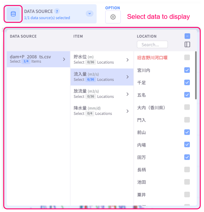
Time Series supports visualizing time-series data as a 2-y-axis plot. To select data to display for the second y-axis, select location(s) and then check the option "2ND Y-AXIS".
Change display style
Click the Option button on the upper left corner of the screen to open the display style settings menu.
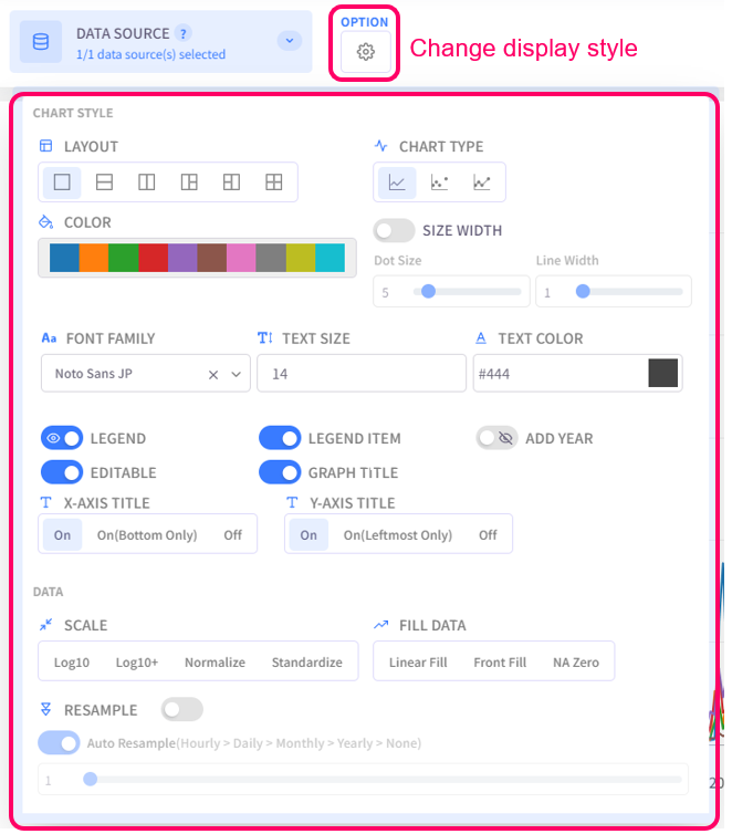
- Layout: select the split screen layout
- Chart Type: select the chart type for plotted data
- Color: select the color palette for the chart
- Size Width: configure the dot size and line width of the chart
- Text Settings (Font family, Text size, Text color): configure the style of text for chart titles, legend items, axis labels
- Legend: click on this option to toggle graph legend ON or OFF. To edit the legend, click on the graph legends located on the right side of the screen. The eco/zip file can be saved with the updated legend
- Legend Item: click on this option to toggle legend item ON or OFF. The eco/zip file can be saved with the updated status of the legend items
- Add Year: display the relevant year of the displayed data in the background of the chart
- Editable: turn on this option to allow changing title of the plot and the axes
- Graph Title: click on this option to toggle the graph title ON/OFF. Show Title X: select the ON/OFF button to show/hide the title on the X-axis. Show Title Y: select the ON/OFF button to show/hide the title on the Y-axis
- Scale: select the data scaling method
- Fill Data: choose how to display missing values (or "NA")
- Resample: configure resample level of displayed data

Review summary statistics
The specifications of displayed time-series data (such as number of data entries, number of missing values, etc.) are displayed on the upper right area of the screen. MIN is the minimum value, Q1 is the first quartile, MED is the median, Q3 is the third quartile, MAX is the maximum value, and STD is the standard deviation.
These summary statistics are recalculated and updated for every display period set in the time player.

Time player
Depending on the time play mode selected in the menu on the bottom right corner of the time player, the displayed time transition from the start date to the end date of time-series data as an animation may be different for each mode.
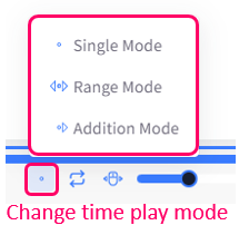
- Single Mode: this is the default mode, in which there is no limit to the display period length
- Range Mode: the display period length is fixed, even when user plays the time transition
- Addition Mode: the display period length is extended as user plays the time transition
Scale chart
You can visually inspect the plotted data by scaling the chart using the mouse cursor or the chart toolbar. To show the chart toolbar, hover the mouse cursor over the chart area.

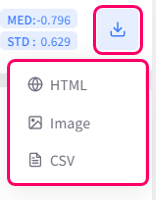
Save graph
You can choose to save the plotted graph as an HTML, image, or CSV file by clicking the Download button on the upper right corner of the screen.