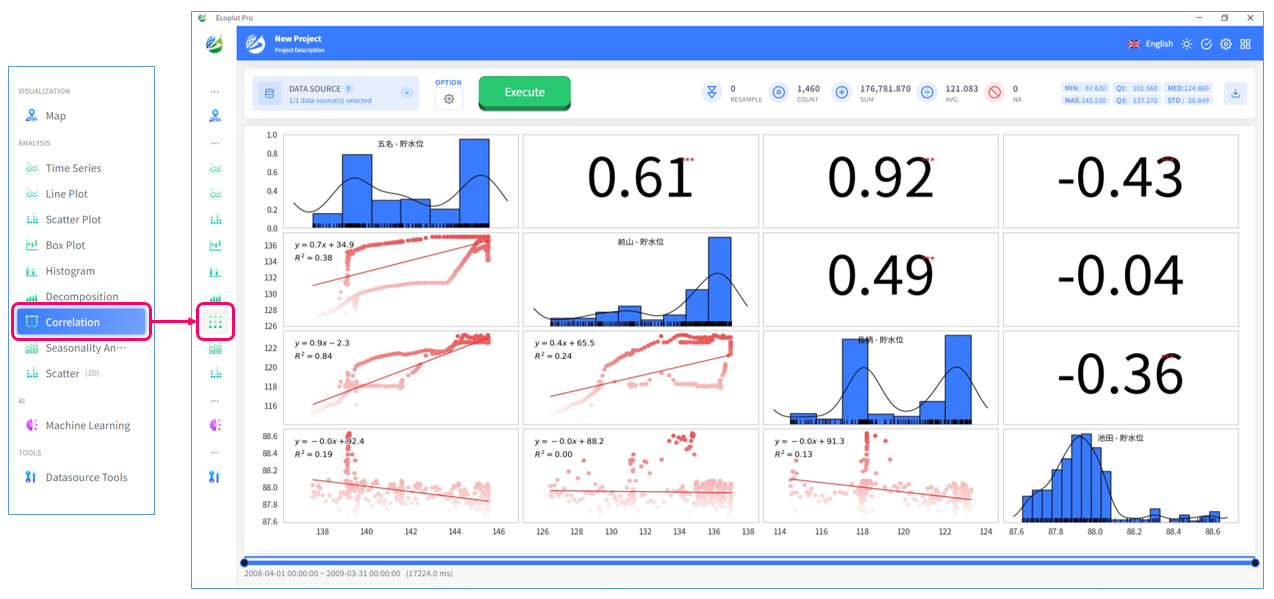
Correlation
Overview
In the [Correlation] tab, you can analyze the relationship between two or more time series data variables. This tab displays a scatter plot of the data points for each variable, along with a histogram representing their distribution and a trend line (approximation line) indicating the tendency of the data points. Additionally, Pearson's correlation coefficient, an index representing the strength of the correlation between variables, is automatically calculated.
This allows you to not only visually grasp the relationship between variables but also quantitatively evaluate it. By using this feature, you can gain a deeper understanding of the correlations hidden within the time series data and utilize it for data analysis purposes.
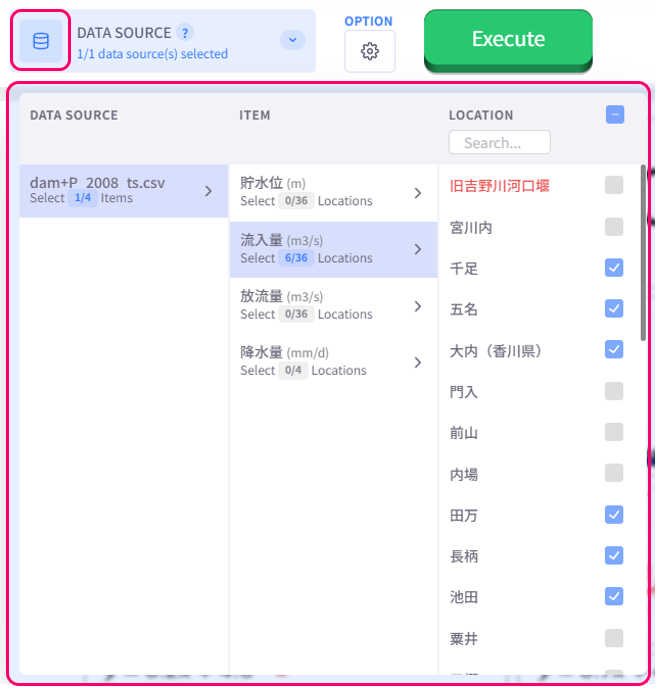
Select data to analyze
Click the Datasource button on the upper left corner of the screen and select the data to analyze. To select multiple checkboxes at once, click the first checkbox, hold down the [Shift] key, and then click the last checkbox to select all checkboxes in between.
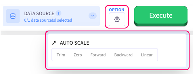
Auto scale
If the time-series data variables are different in the number of data entries, user must select an auto-scale method from the Option menu to handle the differences so that correlation analysis can be performed. How different auto-scale methods work is described below:
- Trim: cut off differences
- Zero: set all differences to zero
- Forward: fill missing value with the value of the data entry before it
- Backward: fill missing value with the value of the data entry behind it
- Linear: fill missing value based on the value of the data entries before and behind it
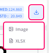
Save result
You can choose to save the correlation result as an image or XLSX file.