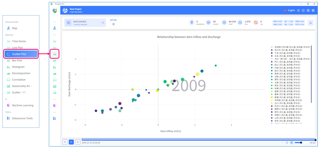
Scatter Plot
Overview
Scatter Plot tab provides a visual representation of the relationship between two variables. Scatter Plot uses a coordinate plane, which is a two-dimension surface formed by two axes (horizontal and vertical axes) to plot data points. Therefore, each data point in the dataset is represented by a combination of horizontal and vertical values. User can specify the size of the data points by specifying a third variable. Through the distribution of data points plotted in this tab, correlation and patterns between variables can be visually grasped.
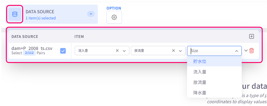
Select data to display
Click the Datasource button on the upper left corner of the screen and select the data to be plotted.
Change display style
Click the Option button on the upper left corner of the screen to open the display style settings menu.
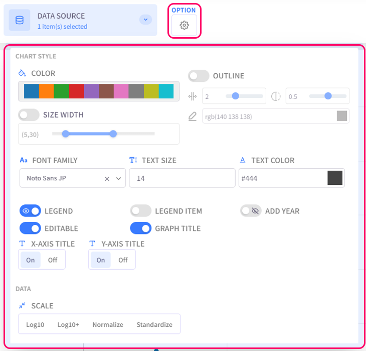
- Color: select the color palette for the chart
- Size Width: configure the dot size and line width of the chart
- Outline: configure the outline of data points
- Text Settings (Font family, Text size, Text color): configure the style of text for chart titles, legend items, axis labels
- Legend: click on this option to toggle graph legend ON or OFF. To edit the legend, click on the graph legends located on the right side of the screen. The eco/zip file can be saved with the updated legend
- Add Year: display the relevant year of the displayed data in the background of the chart
- Editable: turn on this option to allow changing title of the plot and the axes
- Graph Title: click on this option to toggle the graph title ON/OFF. Show Title X: select the ON/OFF button to show/hide the title on the X-axis. Show Title Y: select the ON/OFF button to show/hide the title on the Y-axis
- Scale: select the data scaling method