Dynamic Shape Visualization
Overview
Dynamic Shape Visualization is a feature that allow user to visualize the change of both location and its data over time (unlike normal visualization which can only reflect the change in time-series data of a fixed location).
Dynamic Shape Visualization offers 2 methods which support different usage scenarios:
- Method 1: Process Rate
- Method 2: LAT/LON time-series data
| Regular Location + Time-series data | Process Rate | LAT/LON time-series data | |
|---|---|---|---|
| Color | Linear coloring | Linear coloring;
Progress coloring |
Linear coloring |
| Shape | Fixed location | Fixed location;
Construction progress visualization |
Dynamic location (moving point) |
| Supported geometry | Polyline;
Polygon; Point |
Polyline;
Polygon; Point (SHP/GeoJSON) |
Point (CSV) |
Method 1: Process Rate
Overview
Process Rate is a method for simple binding color of shape in a linear progress with some extra configurations. In most cases, it does not require user for extra effort on preparing data.
Prerequisite
Process Rate doesn't have any strict prerequisite, as user can use any available time-series and shape location datasource. However, in order to color bind in the most eye-catching way or in a way that best assists the purpose of process monitoring, Process Rate should be used with data that are suitable for that purpose.
-
For time-series datasource: There should be a column that well represents process (distance (metre) or progress (%)).
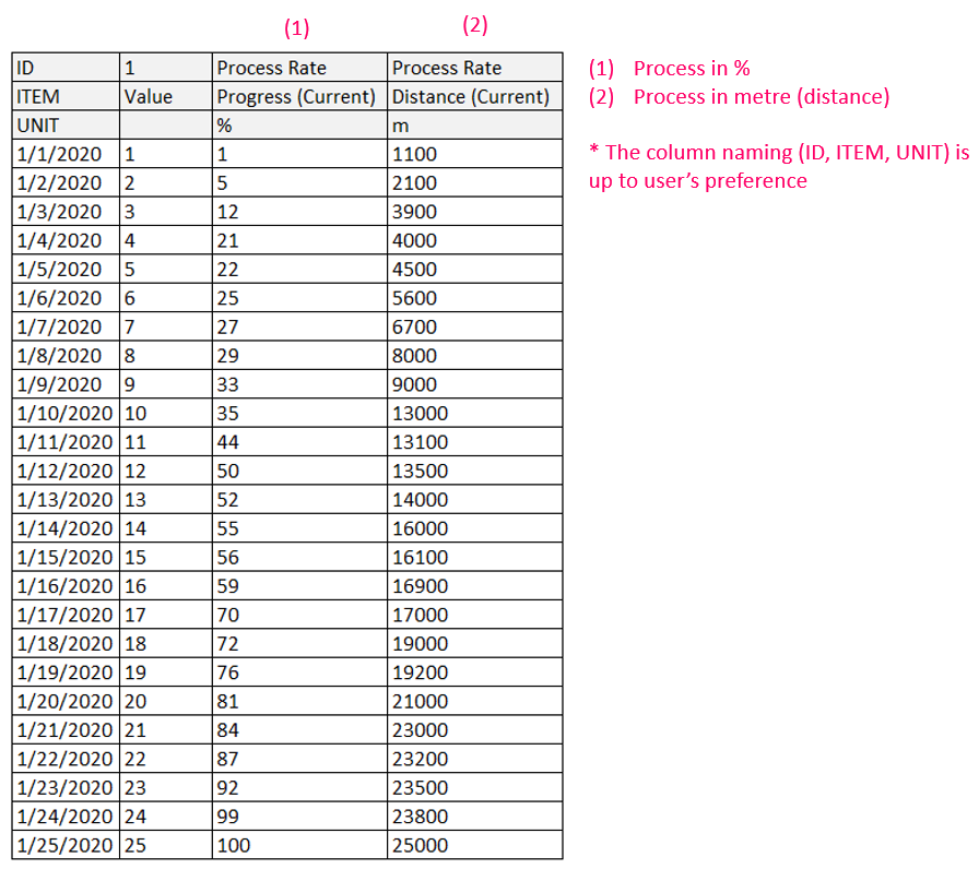
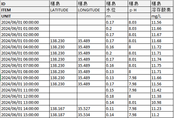
Example of time-series datasource for Process Rate -
For shape datasource: For nice color binding in case the shape has multiple features to be visualized, the shape datasource (SHP or GeoJSON) should have an ID attribute that has unique value for each feature.
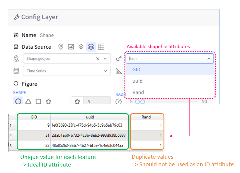
Example of ideal ID attribute
How to use Process Rate
Visualizing progress:
- Import datasources and create shape layer
- Configure layer's datasources. Make sure to select an ID attribute (from the shape datasource) and a matching ITEM (from the time-series datasource)
-
Enable and configure Process Rate:
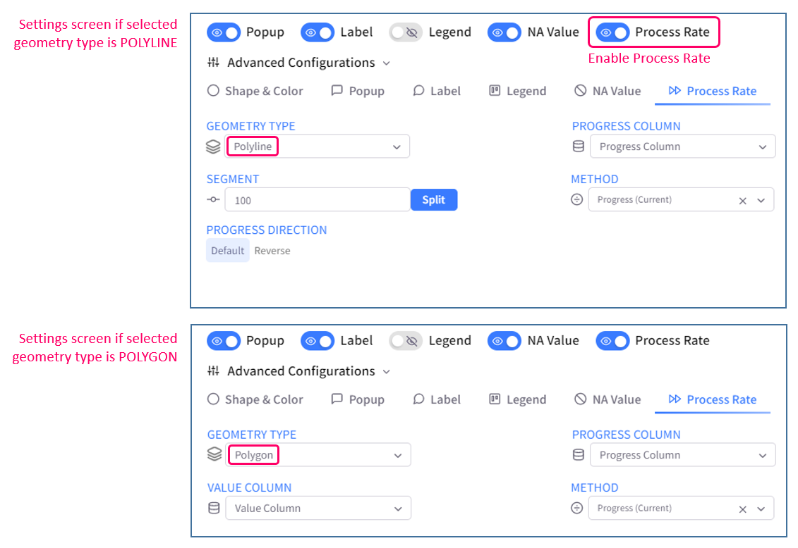
Process Rate configurations - Geometry type: select the type of geometry to visualize process rate
* Each geometry type has a different Process Rate logic, so user should select one that matches with selected shape file. When there is more than one geometry type in the selected GeoJSON, this will determine which feature(s) will get process-rate visualized. - Segment: (for polyline only) specify how many segment that the shape will be split into
* The Split button is for previewing the number of segment in a more visual way, which is helpful for previewing pop-up image's position (which will be mentioned in the next part). Click Split will update the Preview's ruler (note that it does not split the actual shape in the map until user clicks Save (config)) -
Progress Direction: (for polyline only) select the direction that polyline will progress
- Default: From start point to end point of polyline
- Reverse: From end point to start point of polyline
- Value Column: (for polygon only) select a value column in the selected time-series datasource to color bind polygon
- Progress Column: specify which column in the selected time-series datasource will provide data for progress over time
- Method: specify the Process rate method to be used
* User should select a column that well presents progress over time, and the selected progress column and Process Rate method should be suitable with each other.- Progress (Current): progress of each timestamp is counted from the start point by %
- Distance (Current): progress of each timestamp is counted from the start point by metre
- Geometry type: select the type of geometry to visualize process rate
- Configure other display settings to user's preference
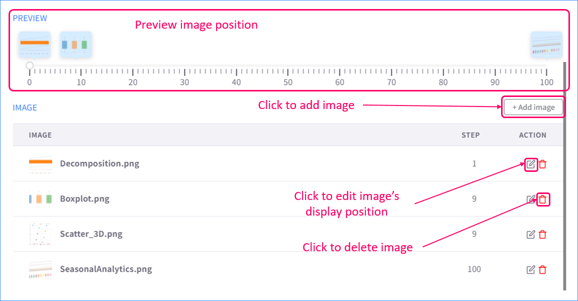
Adding Process Rate pop-up image:
-
To add image to a specific segment, user can either;
- Click a segment on map to open its pop-up and add image to that pop-up (just like with normal pop-up); or
- Open the Process Rate tab in Config Layer \ Advanced Configurations, click Add Image, then after the image is added to the list, edit its step to the desired segment.
- User can preview the image's position in the Preview section.
How Process Rate works
-
Polyline
- Progress segmenting: Polyline will be divided into N segments (N = specified number of segments). Based on the progress column, each timestamp will consist of a number of segments representing its progress.
-
Progress coloring: Segments in the same timestamp will be color binded to the value of that timestamp. In time transtion, new value will be appended to the tail of polyline.
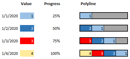
Progress coloring polyline explained - In case of multiple polylines, each line will be split and process-visualized the same way a single line is. The color binding might be different as each line may mapped to a different value column (ITEM).
-
Polygon
- Progress segmenting: Unlike polyline, polygon is divided the way it is (which means the number of segment is fixed).
-
Progress coloring: Progress coloring of polygon is similar to that of polyine, except: progress coloring polygon only requires 1 value column (instead of multiple columns to match the ID of all polygons like normal visualization mode), which makes the remarkable convenience of polygon Process Rate.
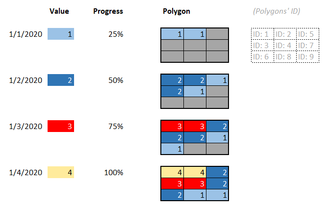
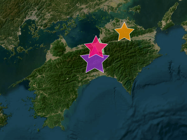
Progress coloring polygon explained - Progress direction: The direction of progress is determined using value of attribute selected as ID. For example, a polygon that has an ID value of the highest position in alphabetical order (in comparison with other polygons') is considered to progress first.
- In case of MultiPolygon (a geometry type that can contains multiple polygons in 1 single feature), all component polygons are treated as 1 combined polygon.
Method 2: LAT/LON time-series data
Overview
LAT/LON time-series data (or dynamic CSV point) is a dynamic shape visualization method that exclusively supports point layer. It requires extra effort on preparing time-series datasource but no extra configuration.
Prerequisite
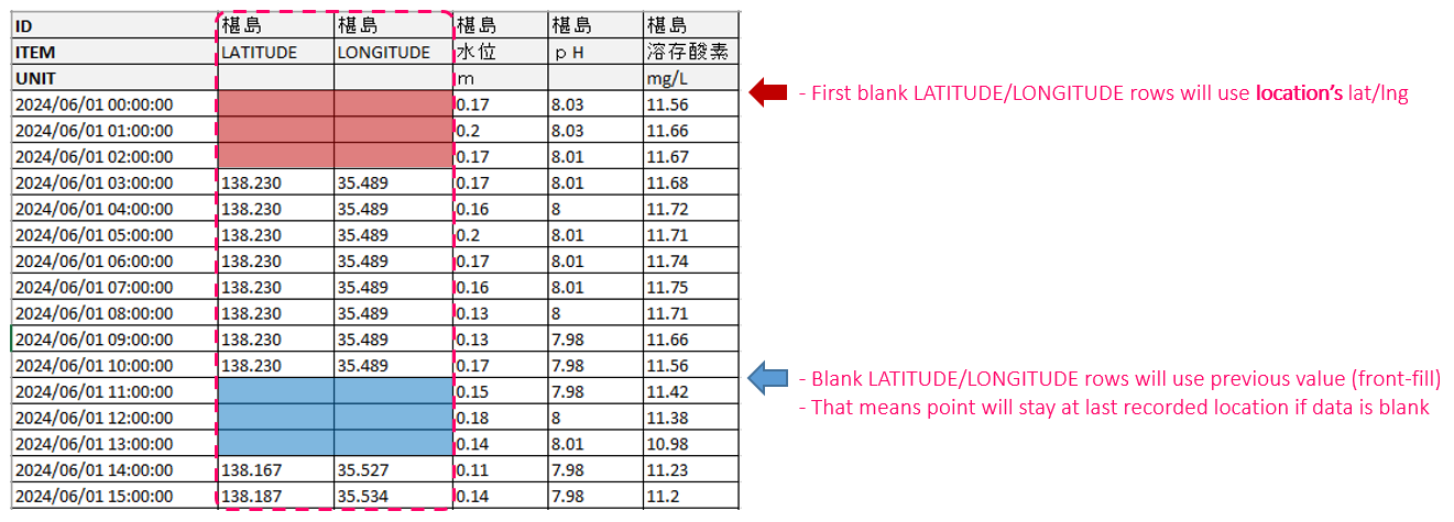
As in the name, LAT/LON time-series data requires user to add 2 columns for LATITUDE and LONGITUDE representing coordinates of each dynamic point.
The coordinate columns must follow these rule:
- ID: has matching ID with point
- ITEM: is either "LONGITUDE" or "LATITUDE"
- Value (coordinate) must be in CRS WGS84
How to use LAT/LON time-series data
Import datasources, create layer, and configure layer just like usual point layer.
* Note that the LATITUDE and LONGITUDE column will not appear in the list of selectable ITEM columns
How LAT/LON time-series data works
The point will be at position specified in the LAT/LON column in the time-series datasource. If the data is blank, point will stay at last recorded position.