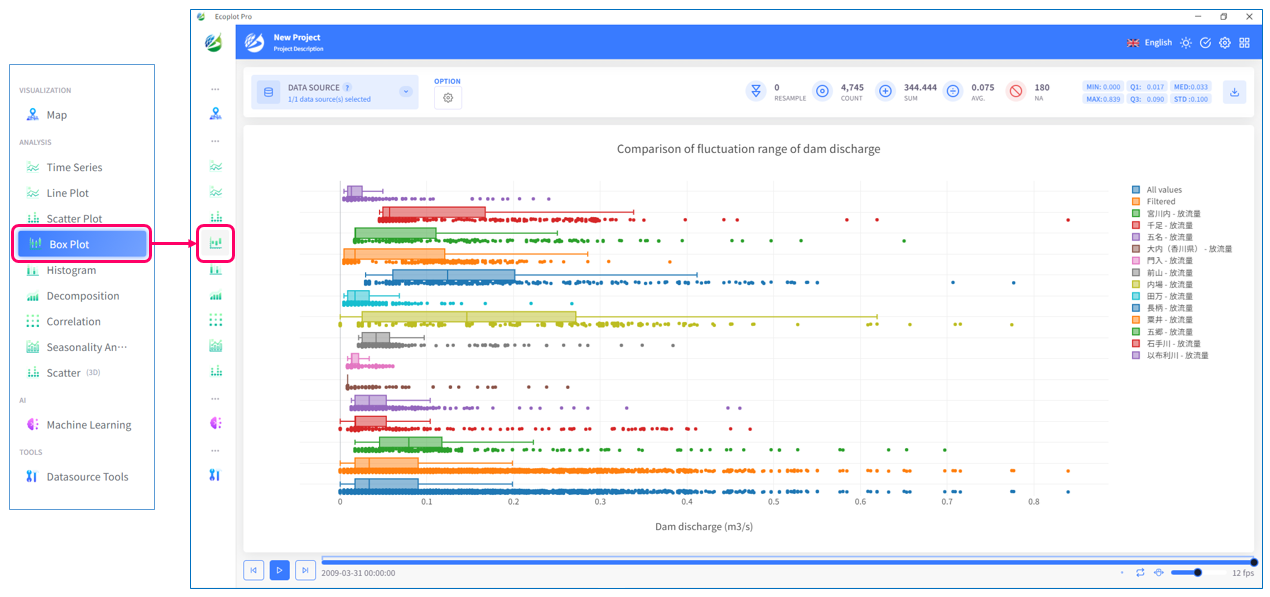
Box Plot
Overview
Box Plot tab represents statistics such as the median of the data, the interquartile range (the range that seperates top 25% and bottom 25% of the data), the minimum value, and the maximum value. The elements of a box plot are described below.
- Box: a box that expresses the interquartile range centered on the median value of the data. The top of the box represents the top 75th percentile (upper quartile) and the bottom of the box represents the bottom 25th percentile (bottom quartile). The height of the box represents the interquartile range and 50% of the data fall within this range.
- Whisker: a line extending from the box, with the upper whisker extending beyond the upper 75th percentile and the lower whisker extending beyond the lower 25th percentile. The whiskers extend to the outer values of the data distribution. However, if it falls outside the range of values defined as outliers, a line is drawn at the tip of the whiskers, and the outliers may be displayed beyond that.
- Outlier: a value that falls outside the range of the data. Outliers are values located beyond the ends of the whiskers. Outliers can indicate anomalies in the distribution of your data.
- Box-and-whisker plot can concisely represent summary statistics such as the median and interquartile range of data, and is useful for understanding the distribution of data and the presence or absence of outliers. Box plot is convenient as it is also used when comparing multiple datasets and helps visualize trends and variability in data.
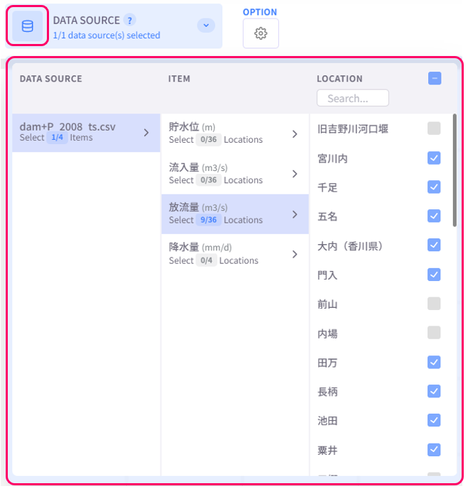
1
Select data to display
Click the Datasource button on the upper left corner of the screen and select the data to be plotted. To select multiple checkboxes at once, click the first checkbox, hold down the [Shift] key, and then click the last checkbox to select all checkboxes in between.
2
Change display style
Click the Option button on the upper left corner of the screen to open the display style settings menu.
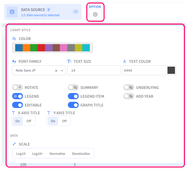
- Color: select the color palette for the chart
- Text Settings (Font family, Text size, Text color): configure the style of text for chart titles, legend items, axis labels
- Rotate: choose to display the chart normally or upside-down
- Summary: choose to whether show or hide the box that represents summary statistics
- Underlying: turn on this option to show all data points
- Legend: click on this option to toggle graph legend ON or OFF. To edit the legend, click on the graph legends located on the right side of the screen. The eco/zip file can be saved with the updated legend
- Legend Item: click on this option to toggle legend item ON or OFF. The eco/zip file can be saved with the updated status of the legend items
- Add Year: display the relevant year of the displayed data in the background of the chart
- Editable: turn on this option to allow changing title of the plot and the axes
- Graph Title: click on this option to toggle the graph title ON/OFF. Show Title X: select the ON/OFF button to show/hide the title on the X-axis. Show Title Y: select the ON/OFF button to show/hide the title on the Y-axis
- Scale: select the data scaling method