Line Plot
Overview
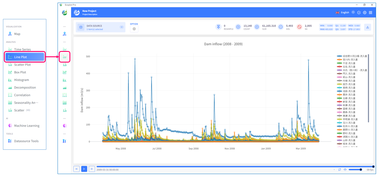
Line Plot tab uses data points connected by lines to visualize time-series data. Line plot is helpful when there is a need to create a graphical depiction of changes in values over time.
1
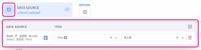
Select data to display
Click the Datasource button on the upper left corner of the screen and select data to be plotted.
2
Change display style
Click the Option button on the upper left corner of the screen to open the display style settings menu.
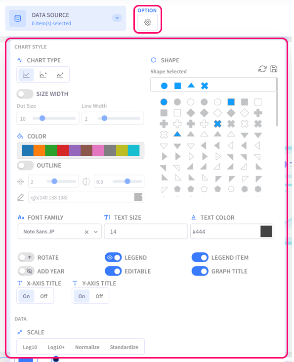
- Chart Type: select the chart type for plotted data
- Size Width: configure the dot size and line width of the chart
- Color: select the color palette for the chart
- Outline: configure the outline of data points
- Shape: choose the shapes that represent data points
- Text Settings (Font family, Text size, Text color): configure the style of text for chart titles, legend items, axis labels
- Rotate: choose to display the chart normally or upside-down
- Legend: click on this option to toggle graph legend ON or OFF. To edit the legend, click on the graph legends located on the right side of the screen. The eco/zip file can be saved with the updated legend
- Legend Item: click on this option to toggle legend item ON or OFF. The eco/zip file can be saved with the updated status of the legend items
- Add Year: display the relevant year of the displayed data in the background of the chart
- Editable: turn on this option to allow changing title of the plot and the axes
- Graph Title: click on this option to toggle the graph title ON/OFF. Show Title X: select the ON/OFF button to show/hide the title on the X-axis. Show Title Y: select the ON/OFF button to show/hide the title on the Y-axis
- Scale: select the data scaling method