APPENDIX 1: Map layers
Overview
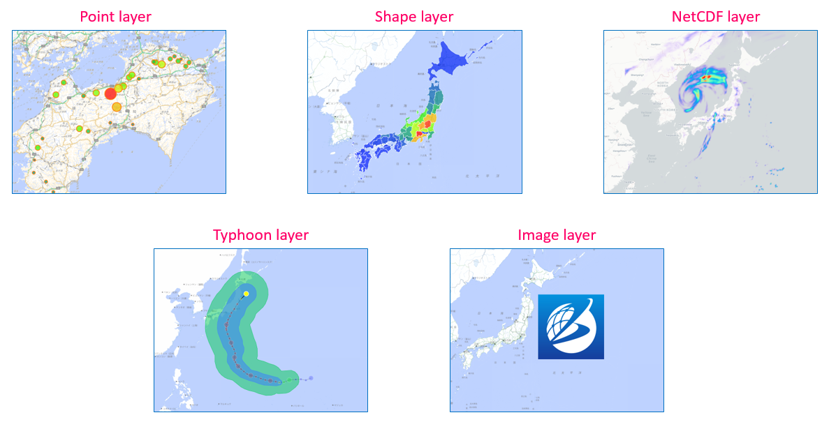
Ecoplot supports visualization of 5 types of layer: point, shape, NetCDF, typhoon, and image.
Key features of point layer
Different display styles of data observation points
The main function of a point layer is to visually represent data observation points. In a point layer, data observation points can be displayed in different styles. For example, by varying the size (or radius) and color of the points, changes in data values can be expressed.
Changes corresponding to the playback of the time slider: In a point layer, the size and color of observation points may change in response to the playback of the time slider. This allows for the visual capture of data's temporal changes.
Customization of appearance: In a point layer, the appearance of points can be customized by adjusting parameters such as shape, color palette, and opacity. This enables a clearer representation of data.
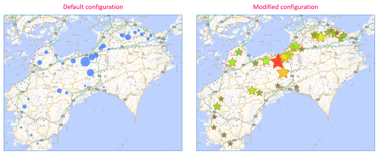
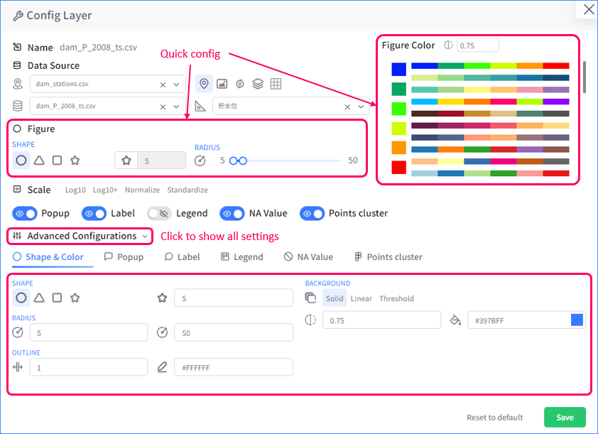
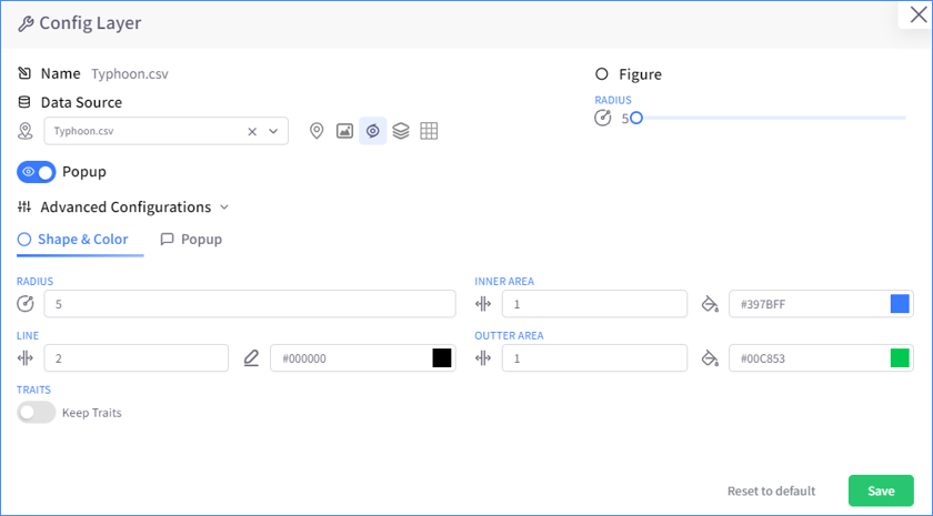
To change display style of observation points, open Config Layer menu and modify Figure settings to your liking.
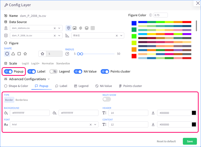
Pop-up
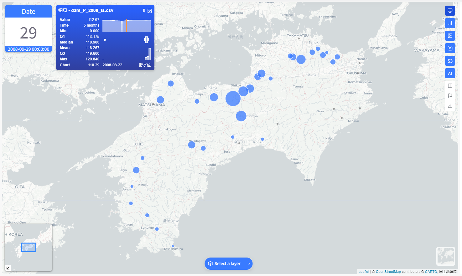
Pop-up is a small menu on the main map screen that shows up when user clicks an observation point. This menu shows detailed statistics about its observation point.

By default, pop-up will sticks to its observation point no matter how user scales the map. However, pop-up can be pinned to a certain position on the screen for better monitoring. Click the Pin button on the pop-up and drag it to the desired position.
To configure how pop-ups are displayed, open Config Layer menu and modify Popup settings to your liking.
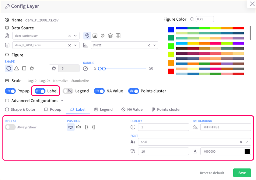
Labels
Label shows the name of an observation point. It whether only shows up on hovering over an observation point or always shows for all points, depending how it is configured.
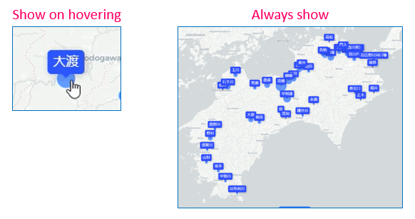
To configure how labels are displayed, open Config Layer menu and modify Label settings to your liking.
Legend
Legend is a panel displayed on the main map screen that shows the data range of its layer and how that range aligns with observation points' color scale.
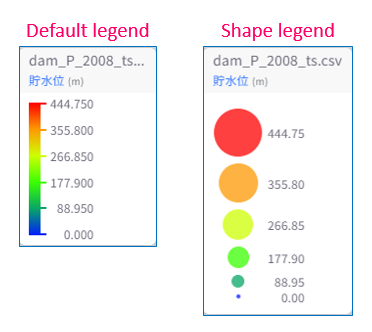
To configure how legend is displayed, open Config Layer menu and modify Legend settings to your liking.
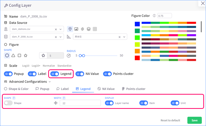
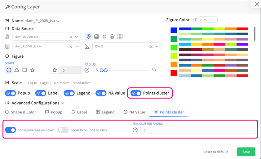
Points cluster
Points cluster is an unique feature of point layer. When it is enabled, observation points will cluster into groups as user zooms out on map.
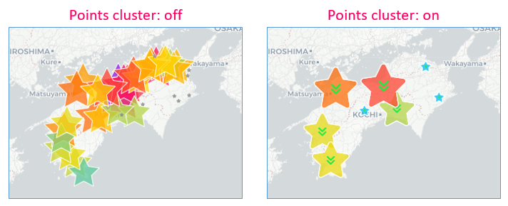
To configure points cluster, open Config Layer menu and modify Points cluster settings to your liking.
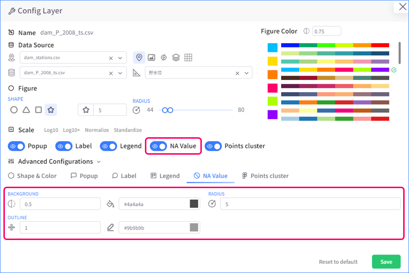
Display of NA values
A datasource may have some observation points that consist of only NA values. Point layer supports visualizing these points with many options. You can choose whether to show these points or not, or make them look significantly different from other points.
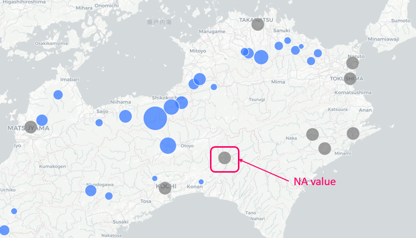
To configure how NA values are displayed, open Config Layer menu and modify NA Value settings to your liking.
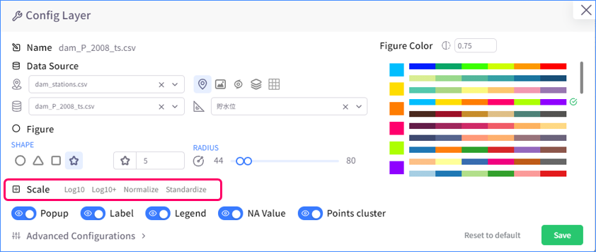
Scale data
Time-series data visualized as a point layer can be scaled by one of four available methods: Log10, Log10+, Normalize, and Standardize.
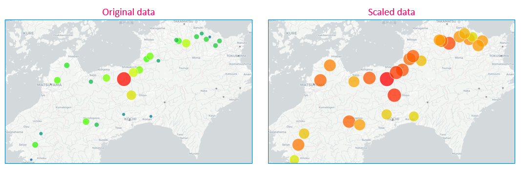
To choose how data are scaled, open Config Layer menu and select a data scaling method in Scale settings. Scaling data through Config Layer menu only affects how data are visualized on Map and does not change the original datasource or affect other analysis tabs.
Key features of shape layer
Because of the significant similarity between point layer and shape layers, almost all key features of point layer can be seen in shape layer, which are:
- Different display styles of data observation locations
- Pop-up
- Labels
- Legend
- Display of NA values
- Scale data
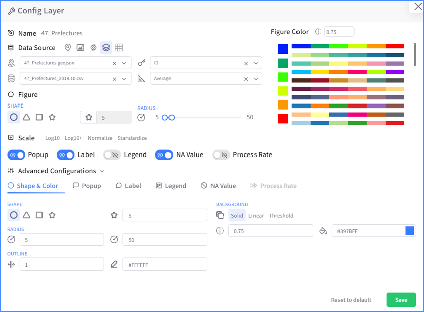
Shape layer is visualized on map as polygons. Unlike points in point layer, polygons do not change its size to show the fluctuation in data value, which makes some key features of shape layer look a little different from point layer when visualized on map. Nevertheless, this difference is minor as shape and point layers are the two layer types that share the most characteristics in common out of five layer types.
Key features of NetCDF layer
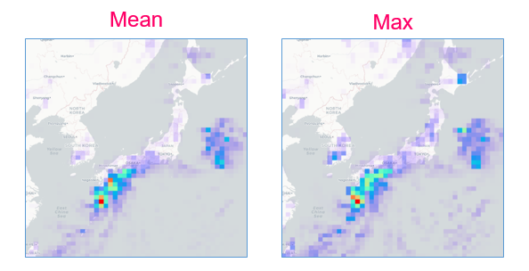
Different display modes
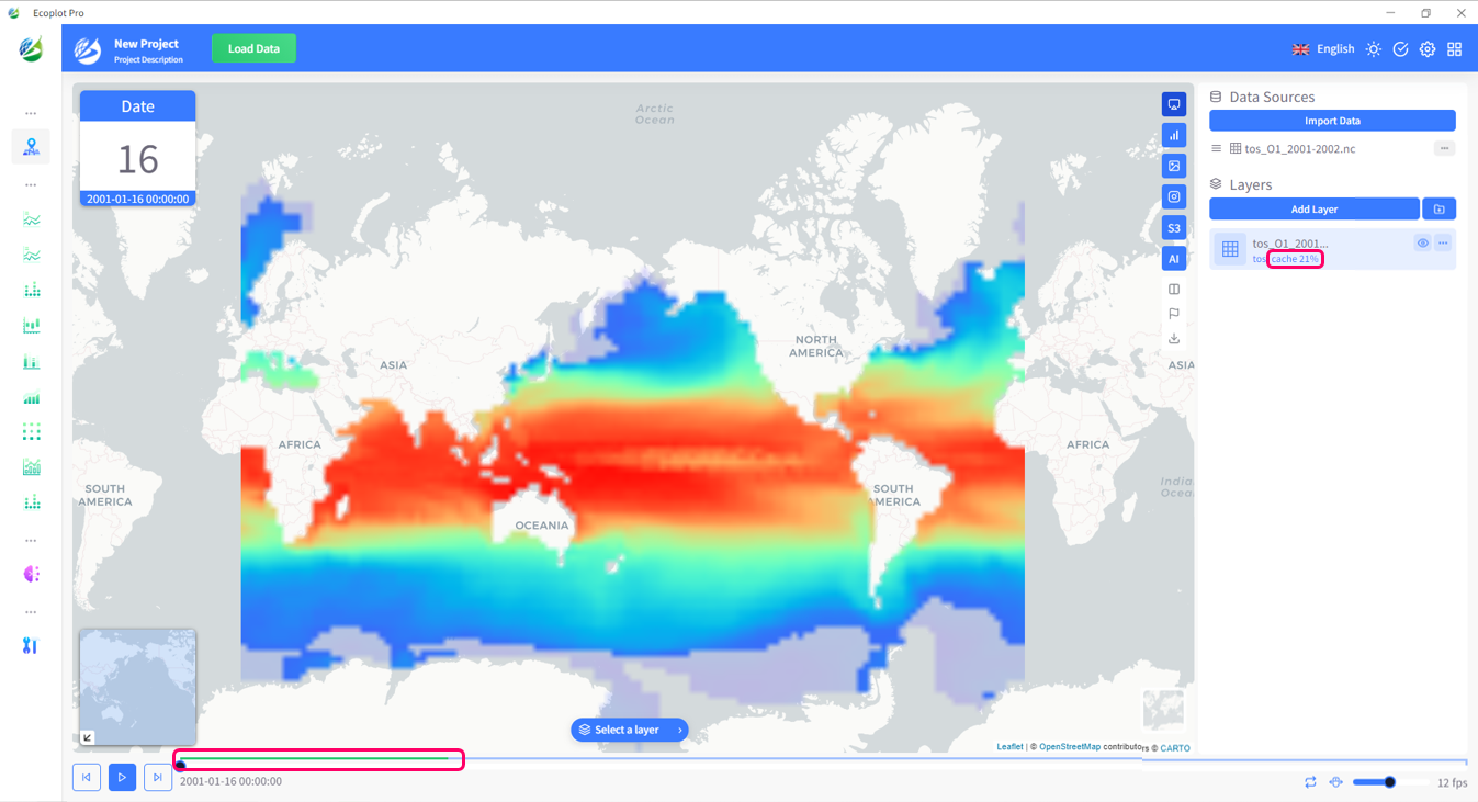
NetCDF (network Common Data Form) is a file format for storing multidimensional scientific data (variables) such as temperature, humidity, pressure, wind speed, and direction. In Ecoplot, NetCDF data can be visualized with various display modes and styles.
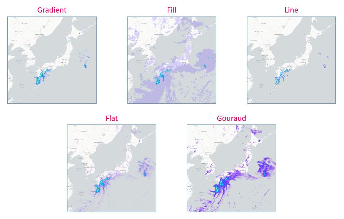
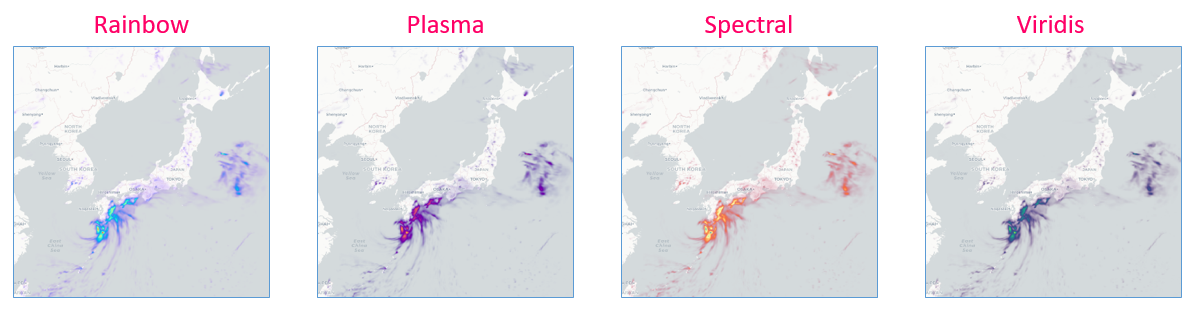
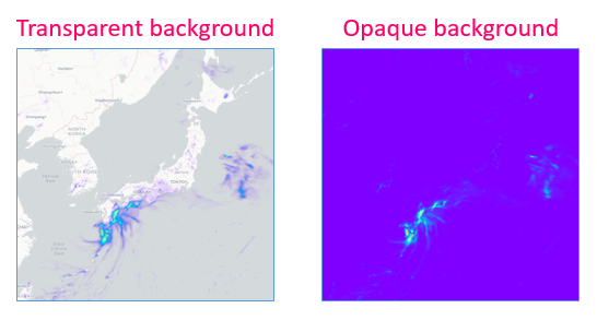

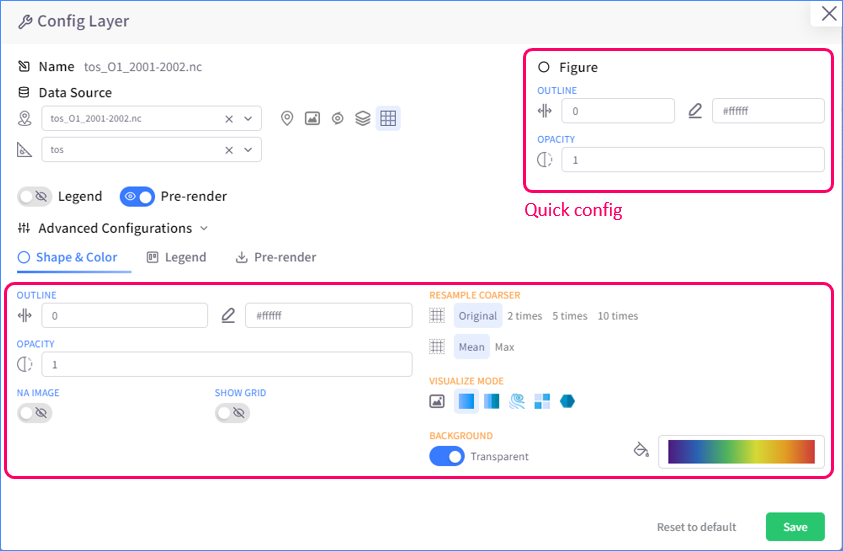
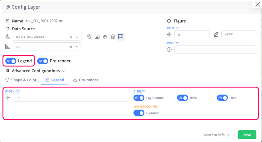
To configure how NetCDF data are displayed, open Cofig Layer menu and modify Figure and Legend settings to your liking.
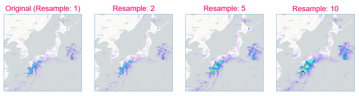
Pre-render NetCDF
In order to see how NetCDF data are visualized and play NetCDF animation, you have to pre-render NetCDF first. By default, pre-rendering will start right after the creation of a NetCDF layer. You can also configure pre-render by modifying Pre-render settings in Config Layer menu.
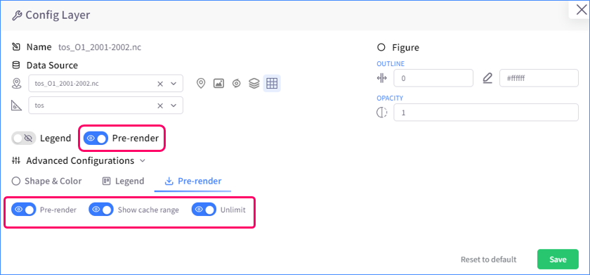
Images of NetCDF layer that are generated from pre-rendering are called cache. You can see how far a NetCDF layer is pre-rendered by looking at the cache percentage on Data side panel or at the layer indicator on the time slider.
Key features of typhoon layer
Pop-up
Typhoon layer, just as what its name means, shows visualization of information on typhoons. Like point and shape layers, typhoon layer supports pop-up, allowing user to view detailed information of a point of the typhoon's trace.
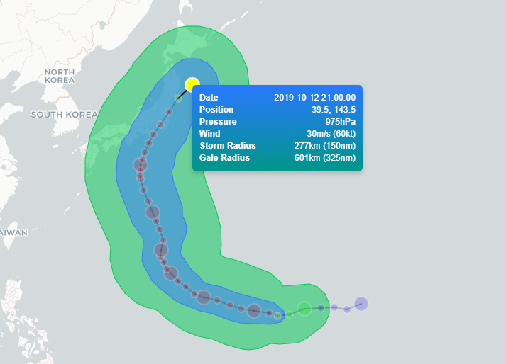
Keep traits
You can configure typhoon layer so that the trace of the typhoon will stay on map even after the time slider plays past its time range.

Key features of image layer
Ecoplot supports inserting image into map as a layer. To be able to adjust the image, you have to drag the image layer to the top of the layer list on Data side panel. Image can be adjusted in 5 ways:
- Move: move image to any location on the map
- Scale: resize image
- Distort
- Rotate
- Free rotate: rotate and scale at the same time
- Lock image: disable adjusting image
