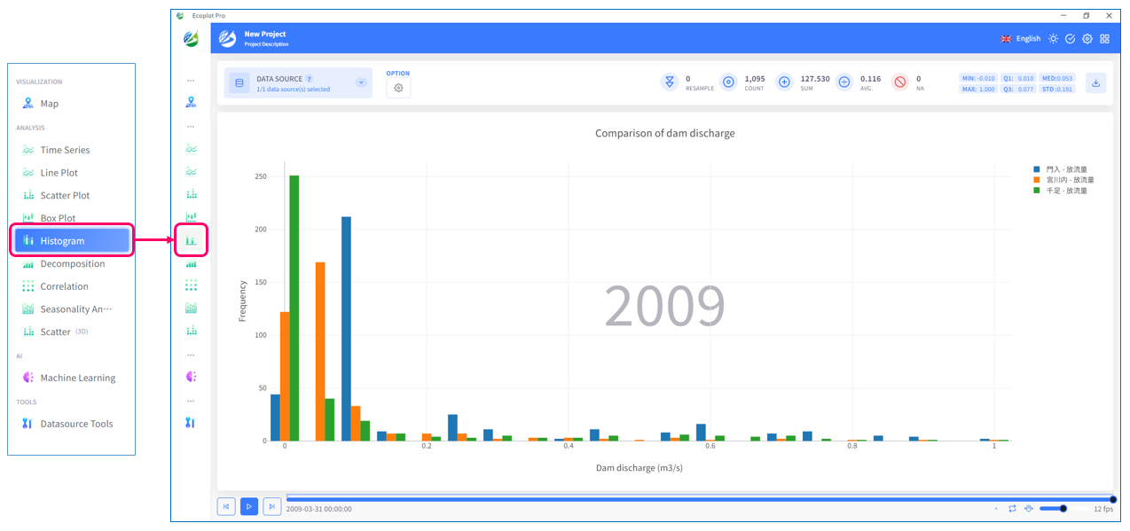
Histogram
Overview
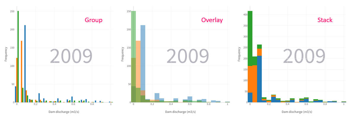
Histogram tab divides time-series data into continuous intervals (also called "bins" or "range groups") and uses bar charts to represent the number and relative frequency of data in each interval. The horizontal axis shows the range groups of data values, and the vertical axis shows the frequency and number of each interval.
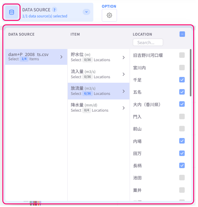
Select data to display
Click the Datasource button on the upper left corner of the screen and select the data to be plotted. To select multiple checkboxes at once, click the first checkbox, hold down the [Shift] key, and then click the last checkbox to select all checkboxes in between.
Change display style
Click the Option button on the upper left corner of the screen to open the display style settings menu.
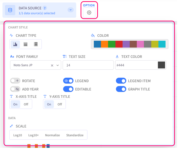
- Chart Type: select the chart type for plotted data
- Color: select the color palette for the chart
- Text Settings (Font family, Text size, Text color): configure the style of text for chart titles, legend items, axis labels
- Rotate: choose to display the chart normally or upside-down
- Legend: click on this option to toggle graph legend ON or OFF. To edit the legend, click on the graph legends located on the right side of the screen. The eco/zip file can be saved with the updated legend
- Legend Item: click on this option to toggle legend item ON or OFF. The eco/zip file can be saved with the updated status of the legend items
- Add Year: display the relevant year of the displayed data in the background of the chart
- Editable: turn on this option to allow changing title of the plot and the axes
- Graph Title: click on this option to toggle the graph title ON/OFF. Show Title X: select the ON/OFF button to show/hide the title on the X-axis. Show Title Y: select the ON/OFF button to show/hide the title on the Y-axis
- Scale: select the data scaling method